8 Soothing Bedroom Paint Colors
In today’s fast-paced world, it’s more crucial than ever to create a peaceful sanctuary in our bedrooms. Amidst the chaos of daily life, a calming and serene environment is essential for recharging and unwinding. To achieve this, selecting the right paint color plays a vital role. When other spaces in our homes are filled with multiple functions, there’s often little respite from the demands of the day.
This is why choosing a soothing bedroom paint color is crucial for creating a retreat that can be your own personal oasis. Here are 8 calming and relaxing colors to help you do just that.
Why Color In Your Bedroom Is Important
In your bedroom, color plays a significant role in creating an environment conducive to relaxation. As a space where you aim to transition from an active state to a resting one, the visual, auditory, and olfactory stimuli are crucial. The colors that surround you can either soothe or stimulate, making it essential to choose hues that promote calmness and serenity.
While color psychology offers in-depth insights into the effects of various colors on our emotions, we’ll focus on those most likely to induce a sense of relaxation. By incorporating these calming colors into your bedroom design, you can create a sanctuary that fosters unwinding and rejuvenation.
Which Colors Are Best For The Bedroom
When it comes to choosing the perfect colors for your bedroom, certain hues can create a serene atmosphere that fosters relaxation and rejuvenation. Among these, blue, green, white, gray, and brown color families stand out for their calming effects. Blue, in particular, is known to induce feelings of serenity and tranquility, making it an excellent choice for bedrooms. Green, on the other hand, brings a sense of balance and harmony, while white adds a touch of freshness and renewal.
Gray provides a neutral background that can help stabilize emotions, and brown evokes a cozy warmth, comfort, and security – all essential elements for a restful retreat.
8 Soothing Bedroom Paint Colors
When it comes to selecting the perfect bedroom paint color, many of us prioritize finding a shade that promotes relaxation and serenity. To help you achieve this ambiance, I’ve curated a list of eight incredibly soothing bedroom paint colors. Each link in this list will direct you to the exact shade, allowing you to purchase with confidence. This selection includes a diverse range of blue, green, gray, and brown tones, ensuring there’s something for every taste.
It’s essential to remember that color is a highly subjective matter, and what may be calming for one person might not have the same effect on another. As such, it’s crucial to make joint decisions regarding bedroom paint colors if you share your sleeping space with someone else. This means consulting with your partner or roommate before making a final decision. The ultimate goal is to create an environment where all occupants can unwind and feel at ease when preparing for rest.
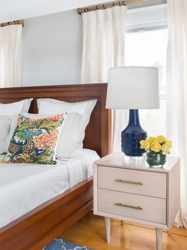
Krypton
Sherwin Williams’ Krypton is a stunning blue-gray hue that exudes a sense of calmness. Its versatility allows it to be harmoniously paired with darker furniture and decorative accents for a rich, deeper look or lighter decor for a bright and airy room. The color’s adaptability makes it an excellent choice for creating a cohesive space.
Furthermore, Krypton complements tan, beige, and brown tones exceptionally well, making it an ideal selection for those seeking to add warmth and coziness to their rooms.
Cotton Sheets
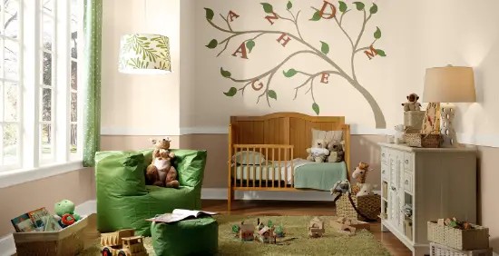
When it comes to designing a kid’s room, having fun with colors is a must. However, striking a balance between vibrancy and calmness is crucial for creating an inviting space that can seamlessly transition from playtime to relaxation. The image from Behr. com showcases a serene beige tone, ‘Cotton Sheets,’ which dominates the upper half of the wall. This soothing hue pairs harmoniously with the darker brown tone on the bottom third, setting a cozy atmosphere.
To create visual interest and add depth, a deep blue or green shade would also complement this neutral base nicely.
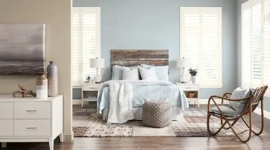
Cyberspace
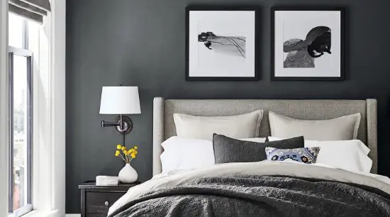
Cyberspace, with its calming gray tone, provides a serene ambiance that can be perfect for a bedroom. Its lightness ensures the space doesn’t feel oppressive, making it an excellent choice for creating a soothing atmosphere. The fact that it allows natural light to shine through, as seen in the example below, is a significant advantage. However, if your room lacks sufficient sunlight, you may consider using this color as an accent wall or opting for a lighter shade altogether.
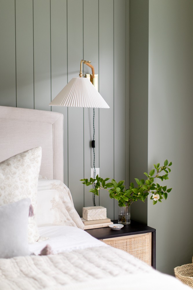
Oakmoss
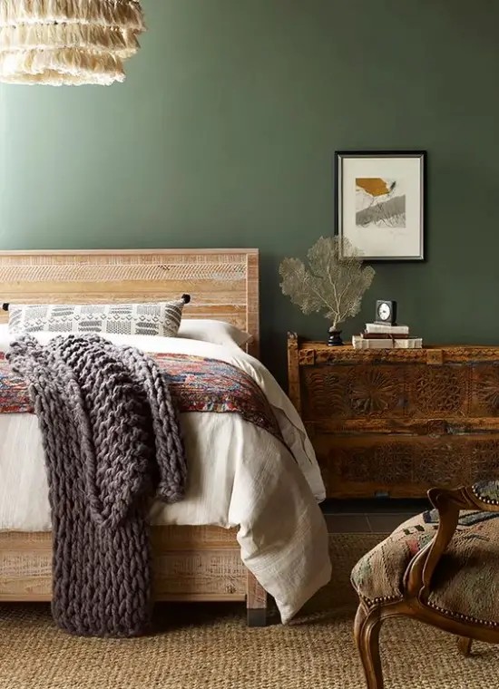
Nature-inspired Oakmoss by Sherwin Williams brings a sense of serenity to this space with its calming hue. The eclectic room design featuring wood tones, tasseled lighting, and varied textures is perfectly complemented by this darker color. What’s more, Oakmoss harmonizes beautifully with any wood furniture, making it an excellent choice for those looking to bring the outdoors in.
Guilford Green

Guilford Green, a shade from Benjamin Moore’s Historic Color collection, is one of 191 colors inspired by iconic American landmarks. This unique green leans towards beige, evoking a sense of neutrality reminiscent of gray. Unlike bold or bright hues, Guilford Green doesn’t elicit strong emotions; its calming nature makes it an excellent choice for creating a soothing atmosphere.
I would recommend pairing this shade with deep brown-toned furniture and complementing deeper greens to achieve a harmonious balance.
Acacia Haze

One of my go-to shades on this list is a mid-tone green that finds itself nestled between Oakmoss and Guilford Green. This rich, balanced hue has a unique ability to make white and cream colors truly pop against its dark background. The color combination in the bedroom featured below serves as perfect illustration of this effect. The harmonious blend of white, cream, and grayish brown tones creates a visually stunning space that showcases the versatility of this versatile green.
Rojo Dust
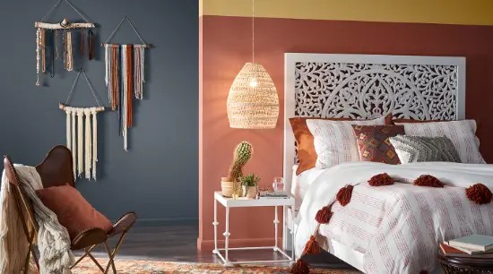
The Rojo Dust shade by Sherwin-Williams presents an intriguing visual experience, existing at the intersection of red, pink, and brown hues. While I perceive it as leaning slightly more towards brown, others might interpret it differently, potentially perceiving a stronger red or pink undertone. This ambiguity may be why I find the color soothing, while others could have a contrasting reaction.
If you’re interested in exploring this shade further, I invite you to share your thoughts and whether you would consider painting a room with Rojo Dust as the dominant color.
Fawn Brindle
Fawn Brindle from Sherwin Williams is an incredibly versatile colour that seamlessly integrates with various home decor styles. Its neutral tone makes it an excellent backdrop for creating distinct looks, whether you’re going for a modern farmhouse vibe by pairing it with white or embracing eclecticism through combination with mustard yellow and terracotta. This harmonious shade not only excels as a soothing bedroom paint colour but also shines in living rooms and dining rooms alike.
In my opinion, Fawn Brindle is a universally appealing choice.
Conclusion
I’m glad you found this list helpful! If you have a bedroom paint color that you absolutely adore, I’d love to hear about it – please share your favorite shade in the comments below. To stay up-to-date with my latest posts and exclusive content, follow me on Bloglovin’, Instagram, Pinterest, and Twitter. Additionally, join my mailing list before you go, and I’ll send you a weekly newsletter filled with weekend reads, decorating inspiration, and the best deals on home decor.
For reference, past issues of my newsletter can be found in the archive here.